November 2013 saw the launch of a new, month-long workshop called Going Abstract. It was so much fun and freeing to spend our time noticing the abstract impressions that are everywhere around us.
Abstract images are meant to be felt, not understood.
How in touch are we with how an image makes us feel? Especially our own images. It’s a great exercise in self-awareness to spend a month noticing in this way. It also gives us clues as to why we are attracted to certain images and what it means for our own photographic style or vision.
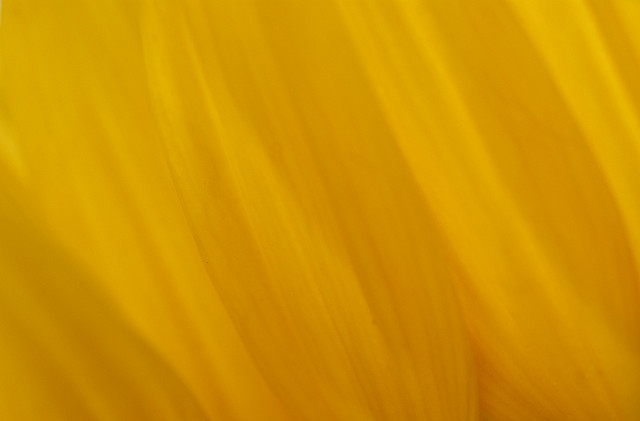
For example, the image above is one of my favourites. It’s a study in yellow – a colour for me that is energizing. It makes me happy. The flowing lines (of the flower) show the subtlety that is present in everything. It feels like freedom.
I asked those who participated in the workshop if they would share a favourite image from the month and here are a few of them.
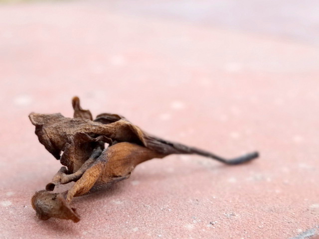
Aarathi wrote:
For me the picture above represents “life.” When I see it, I feel immediately grounded to the moment and become a part of it.
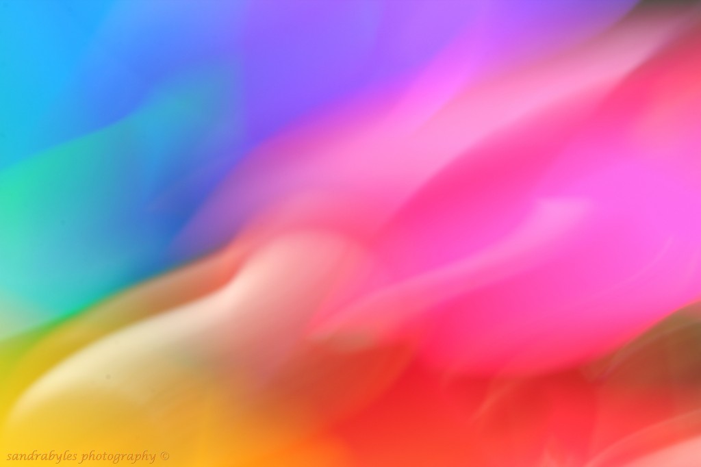
Sandra wrote:
I didn’t quite know where it would go or what form it would take, but as time went on, I think we all started to get the feel of things and jumped into the sheer freedom and creativity of the vast world of abstracts. Thank you too, to all the participants who have inspired and delighted me with all your creativity!
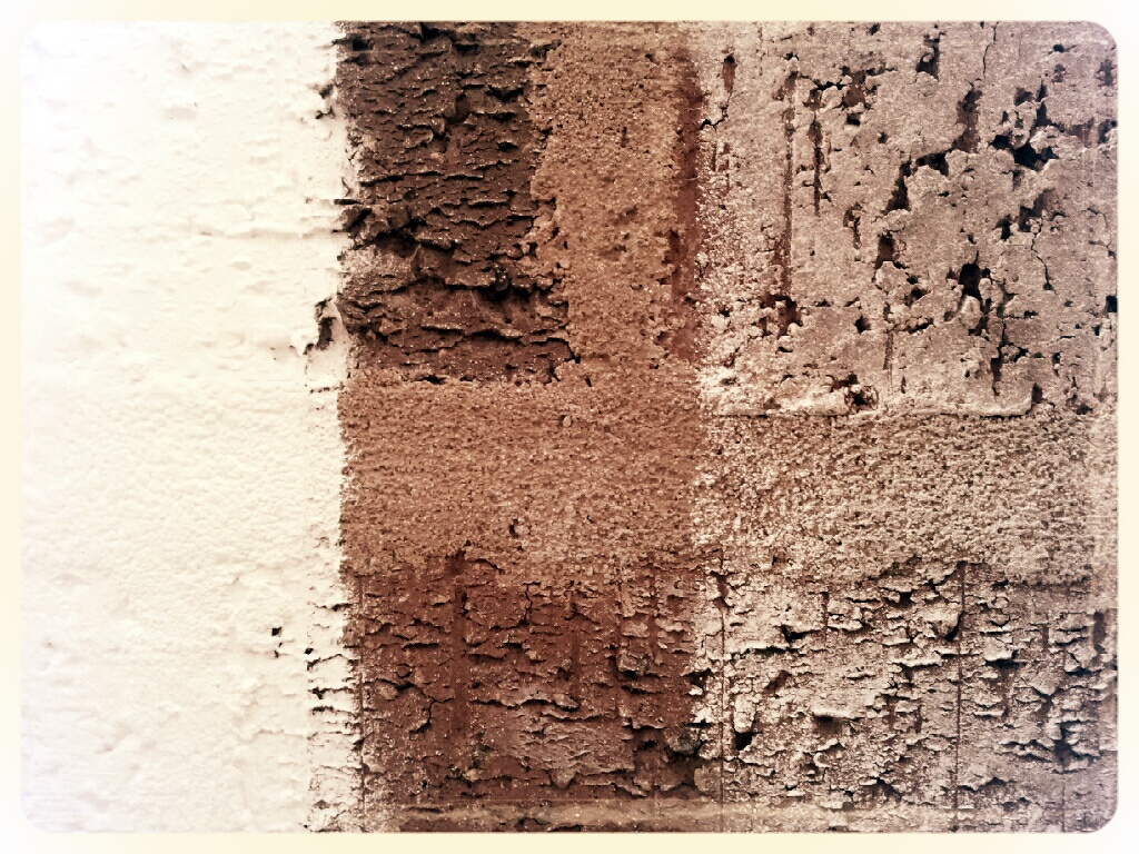
Katherine wrote:
A slapdash approach to painting on this brickwork in a teaching studio immediately made me think of coffee cake or coffee ice cream when I framed it to balance the space occupied by each of the three colours.
Going Abstract will be offered again in February and is now open for registration. Why don’t you join us?


I’m already looking forward to our workshop, Kim! I love the mocha image above by Katherine. The texture and colour are gorgeous.
I can also understand why Aarathi feels grounded to the moment from the image shown.
Gorgeous examples of abstract images – all evoke emotional reactions.
They are all so beautiful.. Mocha is stunning.. and almost leads me on a journey.
Beautiful images. Your abstract class opened a whole new world to me. Thank you so much!
All really beautiful examples of abstract images!
I can’t wait for your abstract class, Kim. I am so inspired by all the work you show here. I started trying abstracts recently and really love what say — that they are meant to be felt, not understood. See you soon!
Such a fabulous class this was! Cant wait to get back to it <3 Love the coffee cake image by Katherine! Would have never thought it to be something else! Sandra's picture …just wow!
I love the idea that abstract photography is something that we are meant to feel rather than understand. It’s good to have an excuse to use our heart and not our head for a change. Thank you. Don
It makes you wonder why we need an excuse, right? Thanks for commenting, Don.