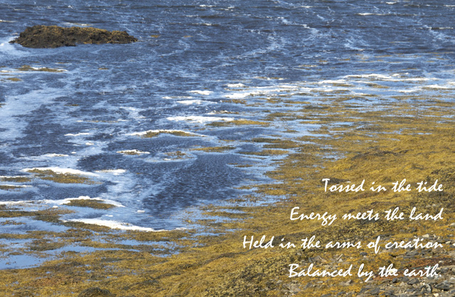
Poetry by Norah Weir Oulahen, Print available at Imagekind
It’s not until we understand balance and energy that we can wield them well. ~ David duChemin, The Visual Imagination
Photo by Design was the first online workshop I created. It’s based on what I learned about visual design from Freeman Patterson and Andre Gallant in their workshops.
The first group went through in Fall of 2011. Last week, the 8th group finished this six-week workshop and I continue to learn from everyone who participates and by repeating the exercises myself.
In our final week, we talk about what makes an image balanced. Balance does not mean symmetrical or serene; it can be asymmetrical or dynamic.
To me, balance is something that is felt and not easily explained.
I often think of that rare fulfilling joy when you are in the presence of some wonderful alignment of events. Where the light, the colour, the shapes, and the balance all interlock so perfectly that I feel truly overwhelmed by the wonder of it. – Charlie Waite
However, in David duChemin’s new e-book, The Visual Imagination (highly recommended for those who like impressionistic or abstract photography), he has a section on balance, and gives us a way of talking about it.
DuChemin suggests examining 10 of your favourite images.
The first step is to circle the element in each image that has the greatest visual weight (or mass) and decide what pulled you there. How is that mass balanced by other elements?
Next, he says to identify how the eye moves through the frame, from where it first lands to where it goes next, and so on, until it ends, gets trapped, or moves out of the frame.
In the image above, my eye first goes to the land (and words) in the lower right. It’s balanced by the water (colour contrast) and the rock in the upper left (size contrast). My eye moves from there to the rock in the upper left. It almost seems to radiate.
The image below was taken recently and felt balanced to me. I’ve shown the visual mass with a black circle and then, where my eye moves, in white. You may experience it differently.
Although, it’s fairly “busy,” the circular theme dominates – from the individual cactus blooms to the edge of the pot, to the spiral shape created within the frame.
The bloom in the lower right third of the frame stands out to me as having the greatest visual weight. While some of the blooms are on the edge of the frame, my eye stays within, taking that spiral shape from its beginning at the bottom left to the bloom at the end.
I share this exercise so that you might try it with one of your images. It’s a good tool to have in your repertoire to be able to know what makes an image work and what doesn’t.
Perhaps the most effective way of learning about balance is by looking at photos that don’t have it… Achieving Balance in shots is something that photographers learn over time. The best way to learn it is to scan through some of your older images, looking for those that could be more balanced. ~ Darren Rowse, Digital Photography School
Learn more about The Visual Imagination by David duChemin.

A great exercise that I need to do myself. Like you, balance seems to be an instinctual thing – but it is something that I need to learn to vocalize, find the words for – so that I can create better images. (Thanks for the thumbs-up for duChemin’s latest ebook – I am considering its purchase).
Thanks for this additional information on balance. It’s a very hard concept for me. I’ll try this exercise on some of my photos. I was glad to be part of your 8th group!
I can see how important balance is in photography and I can also see when I’ve achieved this and when I haven’t! Your examples are really good and I love the shot of the sea. Thank you!