Although I fell in love with photography in a darkroom processing black and white prints, I’ve been strictly a colour girl since going digital in 2007. I’ve converted the occasional image to black and white, but I love colour. It has an emotional pull for me, as it does for most of us.
Since reading the latest issue of Photograph Magazine (Issue 9), however, I may change my tune. The entire issue is about creating black and white images, with a diverse collection of articles – from subject matter (fashion, underwater, architecture, etc.) to technical considerations to expression.
I decided to take a few images of mine from the past year and convert them to black and white. My guess was that a few of them would be more suited to black and white, but for many I thought I would miss the colour.
Well, I was wrong. For me, almost all of the images were strengthened by the black and white conversion. See what you think.
The first three are from Newfoundland.
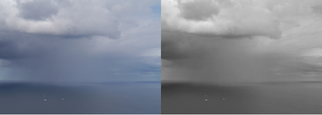
It was raining and a storm was passing over the ocean as we watched from Signal Hill in St. John’s. The blue of the sky and water dominated the scene, yet the storm was the subject, not blue. The black and white version conveys the drama of the storm.
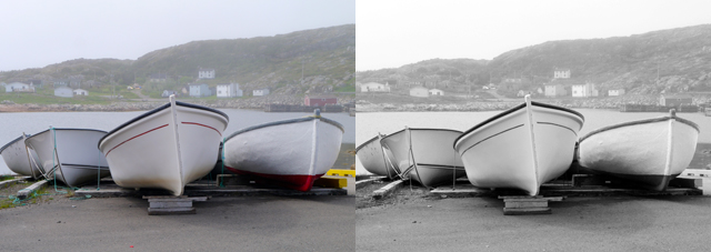
Another foggy day, this time on Fogo Island, created a veiled backdrop to these fishing boats. The shape of the boats is the subject and I’m not surprised that converting to black and white emphasizes those shapes even more.
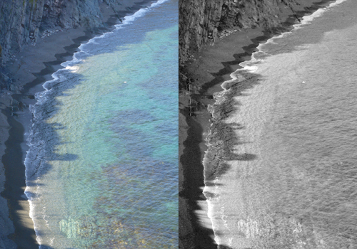
Hiking the Skerwink Trail, we came across this cove and the scalloped shoreline. I loved the colour of the water, but was really drawn to that curving line and composed for it. Converting to black and white emphasizes the line.
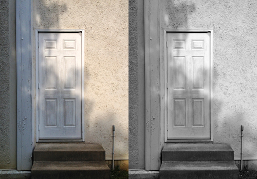
This next one’s a draw for me. I thought for sure that I’d still want the early morning warmth, expressed through the colour in the image on the left. Yet, it was the shadow intersecting the door that drew me and the black and white version emphasizes it.
The following three images are examples of fall colour and I thought they would lose something if I removed the colour
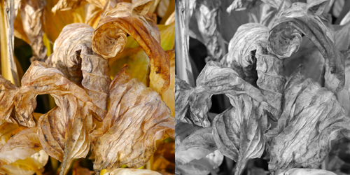
This was a difficult image to compose because there’s so much here. I wanted to show the delicate and elegant curls of these wilted hosta leaves. Converting to black and white seems to simplify the image.
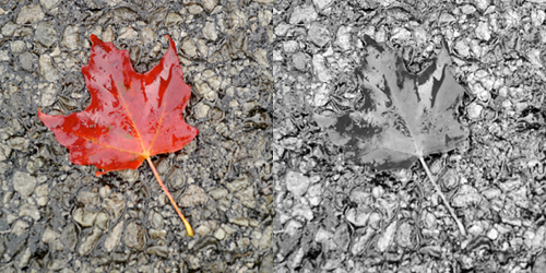
With this one, the colour is a clear winner for me. The leaf almost disappears in the black and white version.
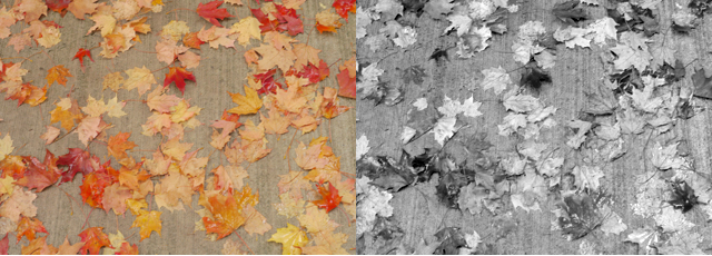
How can you show fall leaves on the ground without the colour? In this case, I think the colour wins out. Yet, there is something almost abstract and lovely about the high contrast in the black and white image. It makes the image look totally different.
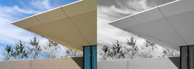
While at Southbrook Winery (a very interesting architectural wonder), I looked up and noticed the trees peeking through the sharp edges of this very modern building. I love the colour version because it reminds me of the warm, late summer day. Yet, the black and white version speaks to me too – of geometric lines and wispy clouds.
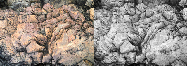
I loved the colour in this rock formation from Newfoundland. To me, the rock looks like a blooming flower and the colour version wins out for me. The black and white version shows off the cracks and crevices more.
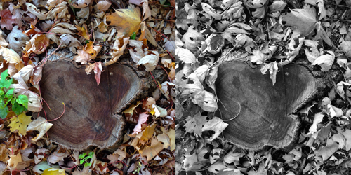
In this case, I was absolutely delighted by the black and white version. I was drawn to this stump boldly proclaiming itself amongst the fallen leaves. The colour here distracts from the stump and removing the colour makes all the difference.
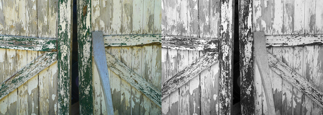
Here too the colour is distracting. I was drawn to the slightly open door and all of the lines that lead the way to that opening. Converting to black and white shows what I saw.
There you have it. If the colour distracts from the main theme, remove it. If you’re emphasizing line or shape or texture (which is often the case with me), black and white may be an option. (Read Martin Bailey’s article in the magazine – When to go Black and White)
How about you? Do you regularly process in black and white? Why or why not?
I have to say that I just the dimension and warmth that colour brings into an image. Black and white is really nice if you want to show lines and texture and I rather like doing street photography in black and white. I can appreciate both colour and B&W, but for my own photography, I do have a market preference for colour, it touches me more emotionally somehow. Though I admit that B&W can be wonderfully dramatic!
I tend towards colour too Sandra, for all the reasons you said, yet was surprised by this little experiment.
Kim, I just popped in again and saw your reply and also saw how many typos I had made! I have a new keyboard which is very flat as opposed to concave keys for the fingertips, this results in rather horrific sentences on my behalf as my fingers slide across neighbouring keys! I really must reread my written texts!
Corrections: “…I just love the dimension and warmth that colour brings into an image.”
also: “I do have a marked preference for colour”! Sorry!
Back to your photography, my favourite B&W capture above is the wilted hosta leaves. They look as if they could be carved in stone, making them very elegant and three dimensional!
Like you, I started film photography in B&W, switching to color when I (very recently) picked up digital photography. As a teen, I learned on a Canon viewfinder camera: Interestingly, looking through that viewfinder, I actually saw in B&W. Not literally, of course, but after taking a picture I would not be able to describe it in colors. When taking the shot, t appeared in my mind’s eye as B&W, which was only reinforced when developing the B&W print.
I’m using a Fujifilm XT-1 mirrorless camera and one thing I like is its very large and bright electronic viewfinder. It’s interesting to toggle between the camera’s color and B&W film simulations, so I can visually “feel” the difference between seeing the image in color and in B&W.
Which is a roundabout way of saying that, for me, the significance of B&W lies chiefly in “seeing” the image when taking the picture, not so much in viewing the developed print. My mindfulness takes place more in B&W, I guess!
Thank you for your great emails and postings. I’m learning a lot from you.
David
Oops, I meant to say Canon *rangefinder* camera, specifically the Canonet QL17. There was something special about that ghostly split-image focusing mechanism that lent an otherworldly quality to the image, which my brain took in a monochrome direction. Remarkable how those early photographic experiences shape how we look at things for years to follow . . .
Oh, that’s so interesting David, that your mindfulness takes place more in black and white. I find that most photographers who create mostly black and white images do “see” the image that way before taking it.
When I first started working in color, this was such a dilemma for me. I love the black and white images emphasis on texture but sometimes it was the color that spoke to me. I agree though, sometimes the color simply “”gets in the way”. It is all about what attracts you and how best to communicate that connection.
Knowing what speaks to you in the image is oh, so important. Thank you, Patricia.
More and more I do black and white conversions, but I adore colour too and will never stop making colour images. There are many reasons I love black and white — and the images that are most suited to it, which you well describe here — but it’s probably the timelessness that attracts me the most. Colour can ground you in a particular time because of processing trends and preferences, which is what you often want and enjoy in an image. But when I want to go beyond, I try black and white. I also find that working in black and white helps me improve my composition and simplify my images to the essentials. (Being a lover of autumn’s colour though, I want to show it in all its glory.)
Sherry, your black and white images are incredible. I’m glad that you brought up the timelessness of black and white, as well as how it can help with composition and simplicity.